Serving thousands of patients across four counties in eastern Maryland, Coastal Hospice is an organization that provides hospice care and resources for patients and families dealing with life-limiting conditions. Clark’s relationship with Coastal Hospice began in 2021, providing ongoing design and marketing support to promote their mission. Through this partnership, their team engaged our designers to develop a new logo for their children’s grief-support summer camp, called Camp Chameleon. Evolved from a former camp program, Camp Chameleon encourages children and teens ages 6-12 to attend a transformational 4-day camp that combines traditional and non-traditional, fun camp activities with grief education and emotional support.
Coastal Hospice envisioned a logo that radiates brightness, vibrancy, and playful appeal, specifically designed for children. The goal of the redesign was to create a logo that not only mirrored the camp’s newfound identity as “Camp Chameleon”, but that would be representative of the positivity of the program itself.
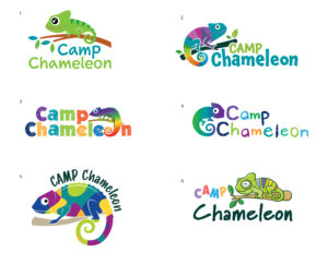
To ensure a diverse range of creative options, we enlisted several of our designers to create concepts for the logo project. The Coastal Hospice team then had the opportunity to give feedback and choose from the various designs. When the final concept was approved, we dedicated our efforts to perfecting and finalizing the logo.
Providing a variety of logo concepts allowed our client to visualize what the branding for “Camp Chameleon” could potentially look like and make an informed decision on the direction. By working collaboratively with our own internal team and theirs, we were able to create a design that exceeded expectations and became the start of the camp’s brand.