Color and Design
BY Randi Hays
Color
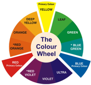
One might think color is pretty simple. I mean, there are only three colors at the center of the color wheel that we refer to as primary colors being: red, blue and yellow. Then why is it when you walk into your local hardware store to buy a gallon of RED paint you have at least 100 shades of reds to choose from?
It turns out color is much more complicated than the primary color palette. Color is very subjective. Yet there are many people who specialize in color and determine what colors you and I will or will not be attracted to.
The color forecast
Did you know there are job postings out there for “color designers?” Color designers travel all over the world to research color. Their main goal is to seek out new colors and introduce them to the rest of the world through textiles, fashion, interior decorating (wall paper, paint, tile, etc.), design (print and digital), makeup and hair dye, industrial design, photography, film, etc.
Color designers and specialists study the emotional effects that color has on people. They study the symbolism behind color. They do market research and look at the trends of colors throughout history. They categorize color in many ways such as seasonal (fall tones), temperature (cool or warm) or personality (sweet, somber or bubbly), to name a few. Check out this graphic about color psychology https://www.webfx.com/blog/web-design/psychology-of-color-infographic/.
Every spring a color forecast is released. It provides a palette of colors one can expect to see in the months and even years ahead. 99designs is a popular blog for designers and they publish a piece on color trends for every year https://99designs.com/blog/trends/color-trends-2018/. The 2018 article goes into great deal about all things happening with color.
Pantone has been at the forefront of color for generations and every year they make a color prediction for the year. This year their color is ultra violet https://www.pantone.com/color-intelligence/color-of-the-year/color-of-the-year-2018-tools-for-designers.
Trends for 2019
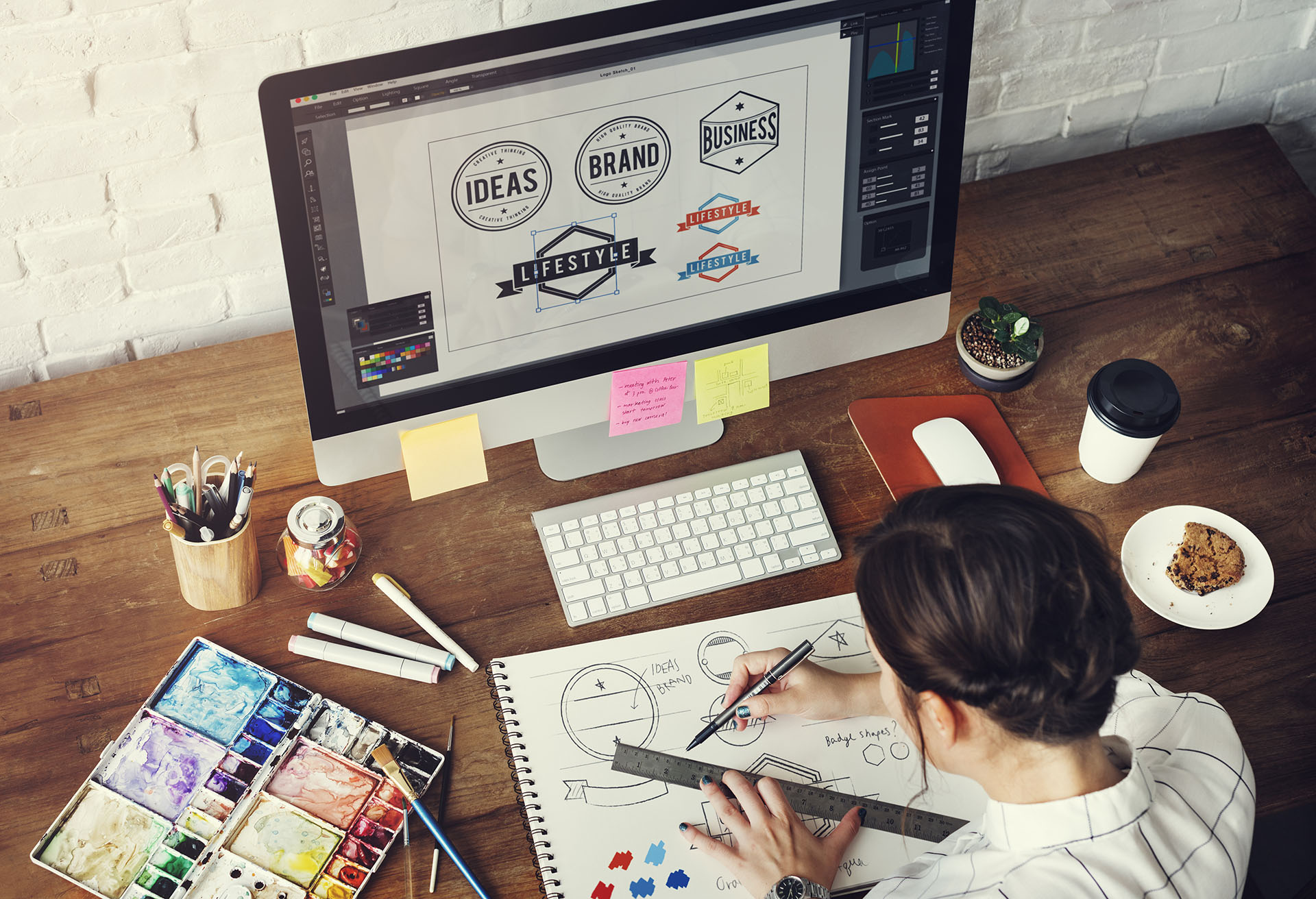
When a designer approaches a project, they put as much thought into the color palette as they do the font choices, the images they will incorporate into a piece and even the type of paper they will be printing on. All of these items work together as a whole to create a strong piece.
At Clark Concepts the same holds true. For the past year we have been working on adding to a branding book for one of our clients. One of the tasks was to add a few new colors to their existing color palette. The new colors have to work with the current color palette. The team at Clark researched colors that would complement one another which make the new additions seem like they have been there all along.
In the design trends for 2019 there is a lot of discussion about the following things you can expect to see in color:
- Brands with a plethora of bold color options. For those of you who think about your brand a lot, this can be a positive and a negative. The positive is being open to a brand that is user friendly and provides a great deal of flexibility. As a designer it is nice to not be designed into a corner. The negative is a brand that may appear too busy because of a color palette; if it isn’t used properly, it can quickly get out of hand.
Check out a few big companies you might know who are giving this option a try:
- Color gradients are making a comeback. They have been for a few years now but lately gradients are finding their way into some pretty significant brands such as Instagram. Gradients provide designers and illustrators with some pretty interesting color options and give dimensionality to design elements or depth to backgrounds. There has been an increase in gradient/conceptual backgrounds available for download on photo sites such as istock and shutterstock, which are royalty free. When these backgrounds are mixed well the outcome is pretty spectacular.
- Same color backgrounds in product photography. There has been a trend lately of presenting product design on backgrounds that match the color of the product (or product photo) itself. The effect is bold, fun and really striking. This technique almost makes the product look toy like.
Something to think about.
What is your favorite color? Why is it your favorite color? Do you like more than o ne color? Next time you are buying paint or happen to be in a clothing shop that organizes the clothing by color take notice. Look at all the options available to you. If you are looking to paint a wall blue, think about the fact that someone asked this question before you even thought of it, “What shade of blue?”
Clark Concepts will ask you the same question when you put your confidence in us with your design, marketing, and web needs.