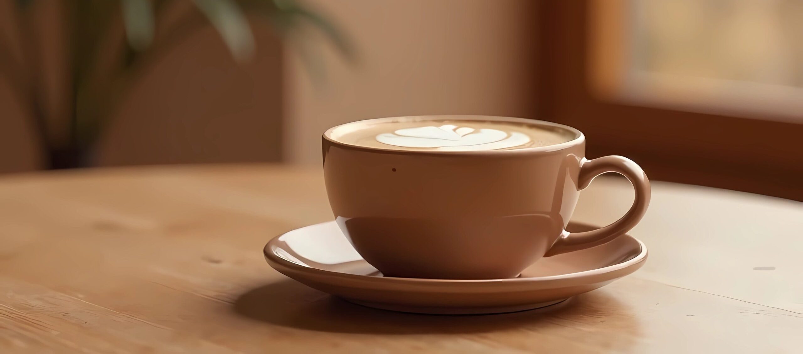
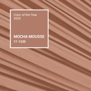
Mocha Mousse: Pantone’s 2025 Color of the Year
BY The Clark Communications Team
What does the Clark Communications team think of the 2025 Color of the Year, Mocha Mousse?
For creatives all over the country, the Pantone Color of the Year can set the tone for their projects, becoming a recurring theme throughout the year. In 2025, Mocha Mousse—a warm, rich, and versatile hue—has been selected, and it’s already making waves. From graphic design and clothing to interiors and even culinary presentations, the creative world often embraces Pantone’s chosen shade as a way to stay on-trend and align with the brand’s vision. However, as with any trend, not all creatives are in agreement, sparking lively debates about its impact and applicability across various industries.

Jayna
It doesn’t surprise me that Mocha Mousse is the color of the year, as I see it trending everywhere. There’s something comforting about it – with an almost ‘buttery’ feel and creaminess. I feel it’s a surprising shade that often gets overlooked next to the chicness of black. Instead of your go-to black, it can now be Mocha Mousse. It reminds me of riding a horse in the crisp fall air with mocha mouse interwoven in the boots, scarf, pants, and autumn scenery. It also reminds me of the brown lipstick shades of my mother’s past. She loves a good brown lip shade, and this would be it.

Jen Owers
I like the shift in mood from past Pantone Colors of the Year to this year’s Mocha Mousse. I’m looking forward to pairing it with some of the deep cherry and oxblood colors that have also been popular this fall/winter.
It also reminds me of how much color is related to the nation’s collective feeling and reflects the country’s need for comfort and stability.

Beth
I’m partial to more earthy tones so I like the color but it’s better when paired with other colors, which gets to the theme of connection, comfort, and harmony. I also like that some of the complementary colors are other rich flavors, such as Chocolate Martini, Chanterelle, and Cannoli Cream.

Scott
I like this color and think it’s a good choice for this coming year. While it does invoke coffee, chocolate, and rich, soothing luxury, I see it as a human color—like a blending of all the shades of humanity. Unity and humanity coming together to help and support one another are of the utmost importance right now, and PANTONE 17-1230 can symbolize that.

Andrea
Mocha Mousse feels very familiar, probably because I see it so often in everyday life, like in home decor, makeup, clothes, and even food! It’s warm and cozy, and I like it way better than last year’s Peach Fuzz. My favorite version of it is when it has a metallic look, which adds a unique shine and elegance to the shade. While I don’t see myself using it much in my graphic design work, I’m sure I’ll keep seeing this shade very often.

Kelly
Mocha Mousse is a color that makes me feel warm and cozy. It pairs well with jewel tones to create a feeling of luxury. I envision a cozy throw blanket and hot cocoa by the fireplace on chilly winter nights.

Morgan
I find Mocha Mousse to be an interesting color. I am a lover of warm neutral colors, and I think it’s a great color that will pair well with other colors, more contrasting colors.

Mark
Brown hues can be grounding and adapt to various design styles, both in online mediums and in physical spaces. The 2025 color of the year can evoke feelings of coziness and security, making it a good choice for e-commerce sites or social media apps. It can work in traditional, contemporary, or eclectic spaces.

Necole
I found my people. Since high school and collecting Teen Vogue magazines, I have always gravitated towards a neutral tone with clothing, decor, and even nail choice. I finally feel like I’m seen, I’m heard, I’m celebrated. As Pantone’s color of the year, I will be on brand throughout 2025 as even my suction phone case is Mocha Mousse.

Brendon
Who doesn’t love chocolate? Mocha Mousse is a rich, versatile tone that blends warmth with sophistication. It evokes warmth, comfort, and a modern but earthy elegance. Perfect for packaging, digital design, or lifestyle marketing, it’s a solid choice that connects with consumers seeking authenticity and grounded appeal.

Rochelle
I heard a story on NPR last month on color / palette trends. I was intrigued to learn that in times of uncertainty (or even volatility), shared color preferences tend to trend towards neutral colors. Seeing Mocha Mousse immediately reminded me of the NPR story. The color is earthy and brings me to my center. Yet it has a hint of glimmer – reminding me of the things to look forward to.
The color does not at all excite, invigorate or provoke.

Melanie
What I like about Mocha Mousse is that it’s a warm, inviting neutral but it isn’t at all bland. It offers depth on its own or when paired with other muted-toned palettes. I look forward to seeing how this color is incorporated in 2025, from fashion, to interior decorating, makeup, and other design formats.