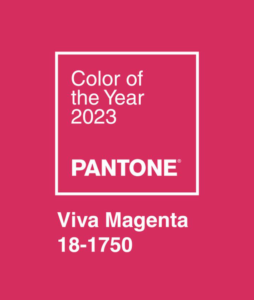
Viva Magenta! Pantone’s 2023 Color of the Year
BY Clark Communications Design Team
 Designers and other creative professionals around the world take inspiration from Pantone’s annual selection–so keep an eye out for this color to take center stage this year in everything from fashion to product design, technology, branding, and more.
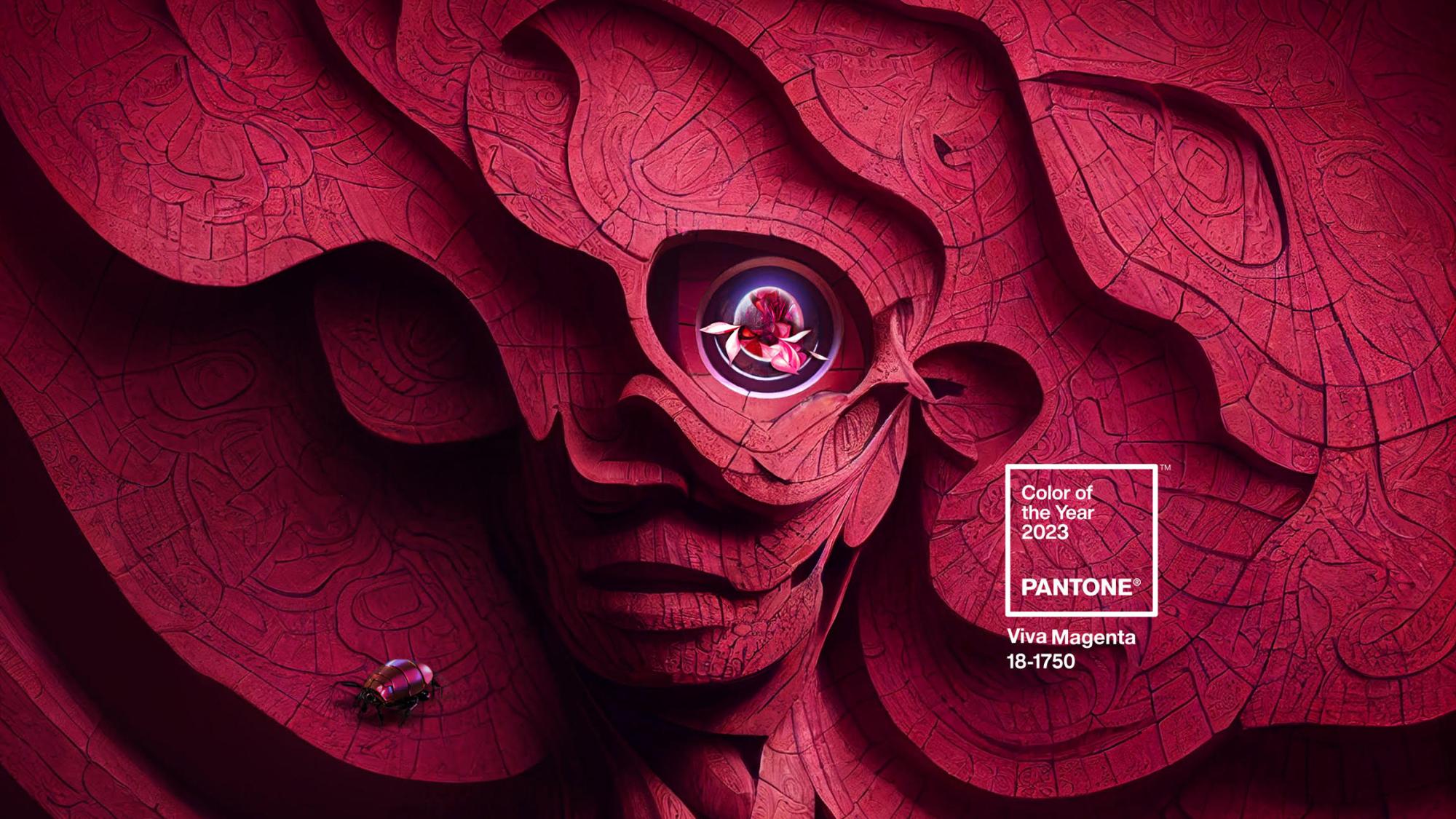
Pantone Color Institute says this year’s color is derived from nature – specifically, the cochineal beetle. Apparently, it’s the crimson color of dye the beetle emits.
We don’t know about beetle dye, but it’s a nice pop of color. Be it red or pink, it has great potential, bold enough to stand on its own, and vibrant enough to be an accent color. Pantone’s “Magentaverse” includes pairing the color with soft hues of sand, beige, gray, and blue – lending itself to many possibilities for a designer to keep in their toolbox.
Let’s see what our design team thinks of the color!

Scott
I think Viva Magenta is a great pick for Pantone’s color of the year 2023. It’s bold, lively, and hopeful! It’s as if celebration was a color. It really catches the eye and draws you in. I look forward to adding it where I can to give my animations a little extra pop!

Jen
I like Viva Magenta, Pantone’s color of the year! I’m mostly drawn to the boldness of it. It’s still bright without it saying “look at me!”—think a more sophisticated Barbie pink. And I like how it can fit in with many different color types—bold berry colors, pinks and reds, and even as an accent to a pastel color palette. I’ve also been trying to wear more monochromatic outfits in this color and think it will go well with a lot of my wardrobe!
But one of the things I’m looking forward to the most in Viva Magenta is… *drumroll*…cocktails! With the announcement of Pantone’s color of the year, several bars and restaurants created drinks inspired by the color. I can’t wait to add these fun pops of color to my Insta! Cheers to 2023 and cheers to Viva Magenta!

Morgan
Because of the blue undertones of Viva Magenta, it gives off vibrancy and sophistication at the same time. I like it because it has a luxurious feel and can be used within a wide range of design spaces (whether as an accent or primary color within a palette). According to Refinery 29, Lee Eiseman, executive director of the Pantone Color Institute “the color is crimson red, hot pink, fuchsia, raspberry, and maroon, all at once. It’s flowery and natural, but it’s also slick and shiny, just as good for lipstick and clothing as sports cars and cell phones.”
Fun fact: Viva Magenta is actually the color that TikTok uses for its “follow” and “upload” buttons (New York Times).

Andrea
I love the name of this year’s Pantone color because it is lively, celebratory and it seems like a great way to kick off the new year. The first thing that caught my eye was the color’s richness and vibrancy. I can see it being paired with many different colors and creating great contrast with lighter, more muted ones. I will probably be using Viva Magenta as an accent color in designs to help bring life to my creations and make them stand out. On a personal note, I think this color would work well in clothing for both winter and summer, so I can see myself wearing it throughout the year.

Randi
Unfortunately I do not see shades of deep pink or magenta. I see a warm red. A red that has been darkened with the slightest touch of purple pigment. Looking through past color winners, Viva Magenta bears a striking resemblance to the 2002 Color of the Year, “True Red”. Hmmm….
Color is a fascinating subject and how color forecasts are researched and decided are very interesting and involved. I fully expect to see “Viva Magenta” as a: nail polish option, on a throw pillow or a dinner napkin, a color on my daughters next bathing suit and my favorite everyday item—an insulated water bottle. Viva Magenta, I will be looking for you on the shelves at Target and other places.
Welcome to the color palette!